‘Tanabata’ - Film Campaign
For this project, I was tasked with creating a campaign around a product or cause.
I chose to create an advertising campaign for an animated children’s movie centered around an original piece adapted from the existing East Asian story of Tanabata. This allowed me more freedom to design a wide range of assets and experiment with different outputs such as a posters, a logo, animated stickers and character designs, as well as a short picture book - often seen alongside the release of animated films to promote it.
Character Design
When researching for the character designs, I was inspired by the the ornate and intricate patterns and designs
found on Japanese textiles and items. I found this highly relevant to Orihime’s role as a seamstress and brought this forward in my own designs.

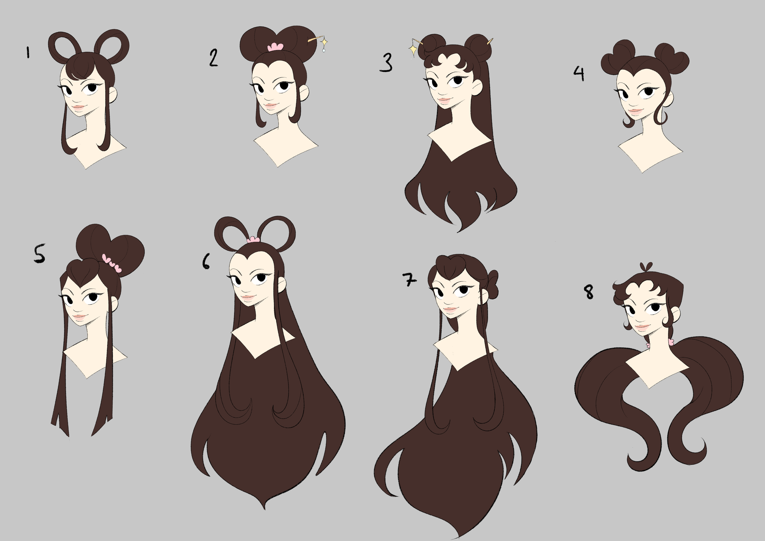

Princess Orihime
When creating Orihime, I led with the idea of her having a heavy heart motif. To point to her position as a princess, I also designed the skirt of her dress to be fuller, emulating those of princess dresses.

Momo
Momo is an original character I added to the tale to serve as Orihime’s familiar. I noticed that Dinsey Princesses often have an animation sidekick to go with them, and felt the inclusion of magpies in the original story made room for this.
When designing her, I wanted her to have a palette that matched Orihime’s, hence the decision to give her pink feathers. I also felt that using black may be too harsh of colour when placed next to the other characters, so I decided to go with dark purple instead.

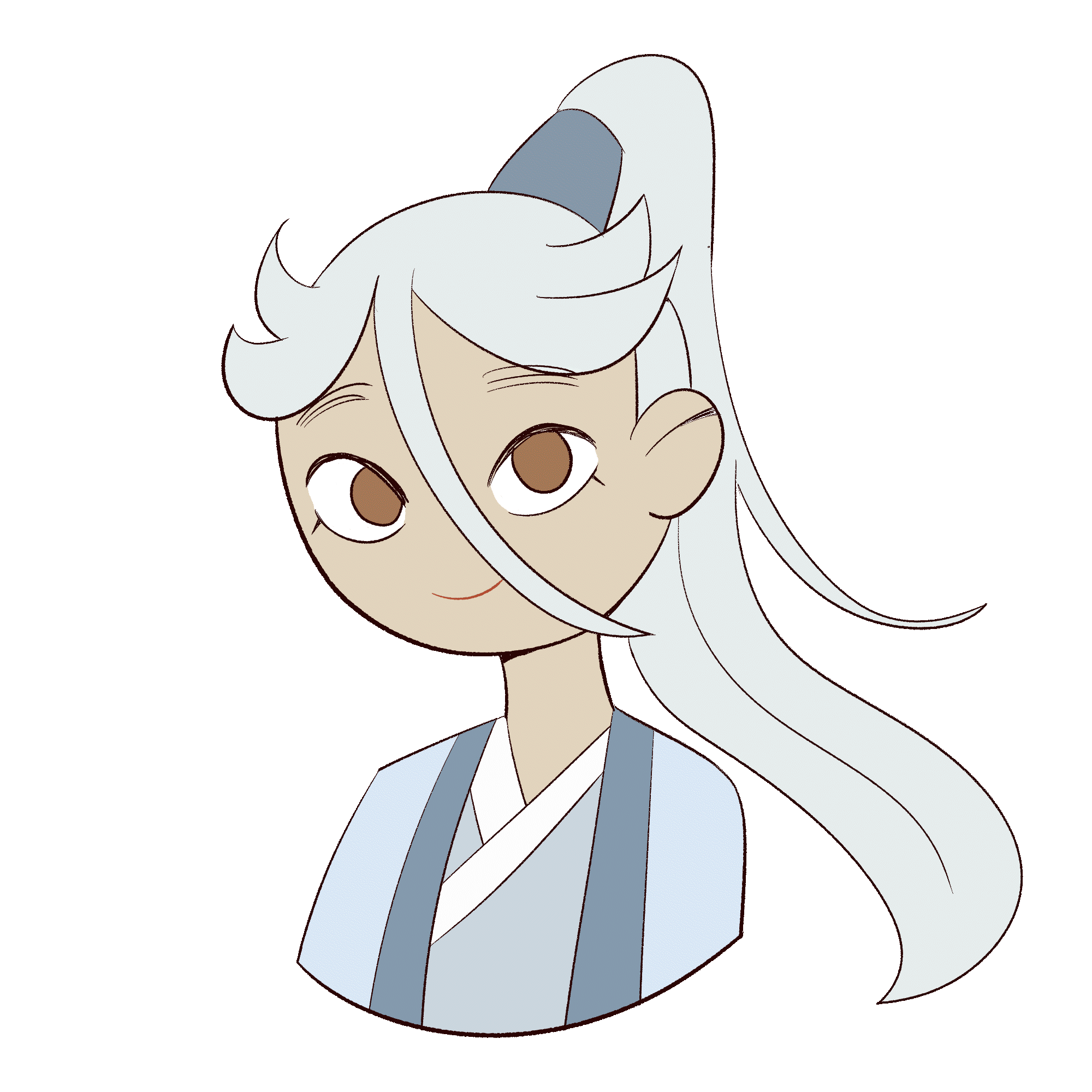
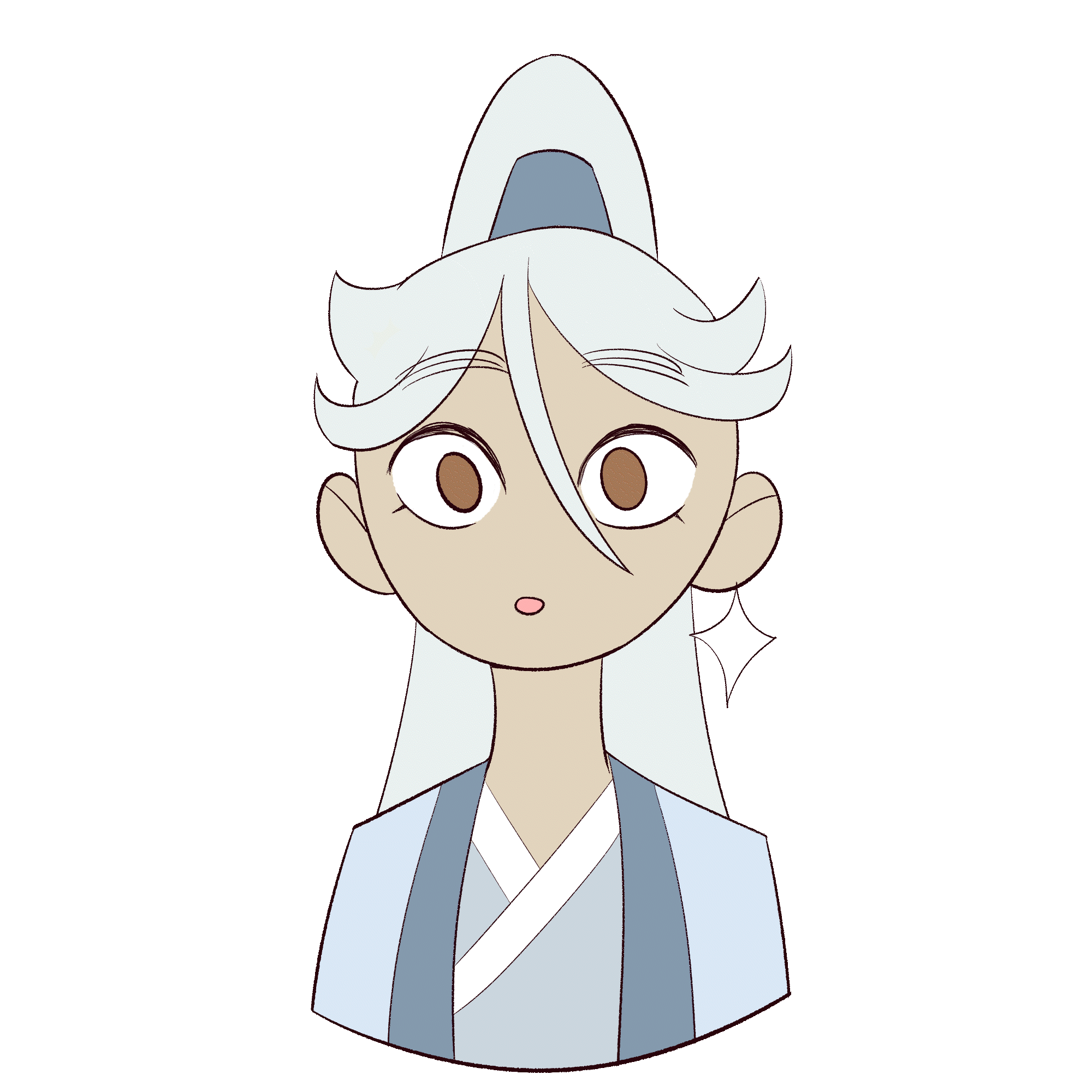
Hikoboshi
Hikoboshi was designed with the idea of him seeming almost ethereal and prince-like, borrowing from the Eastern anime trope of “bishounen” or beautiful men. This includes giving the character almost “effeminate” features such as long hair. I wanted this to come across while still taking heavily from the clothing of Japanese farmers.


God of the Heavens (Tentei)
entei was designed with the idea of him being regal, imposing and highly decorated. Inspiration came from the clothing of Japanese emperors.


Book Design
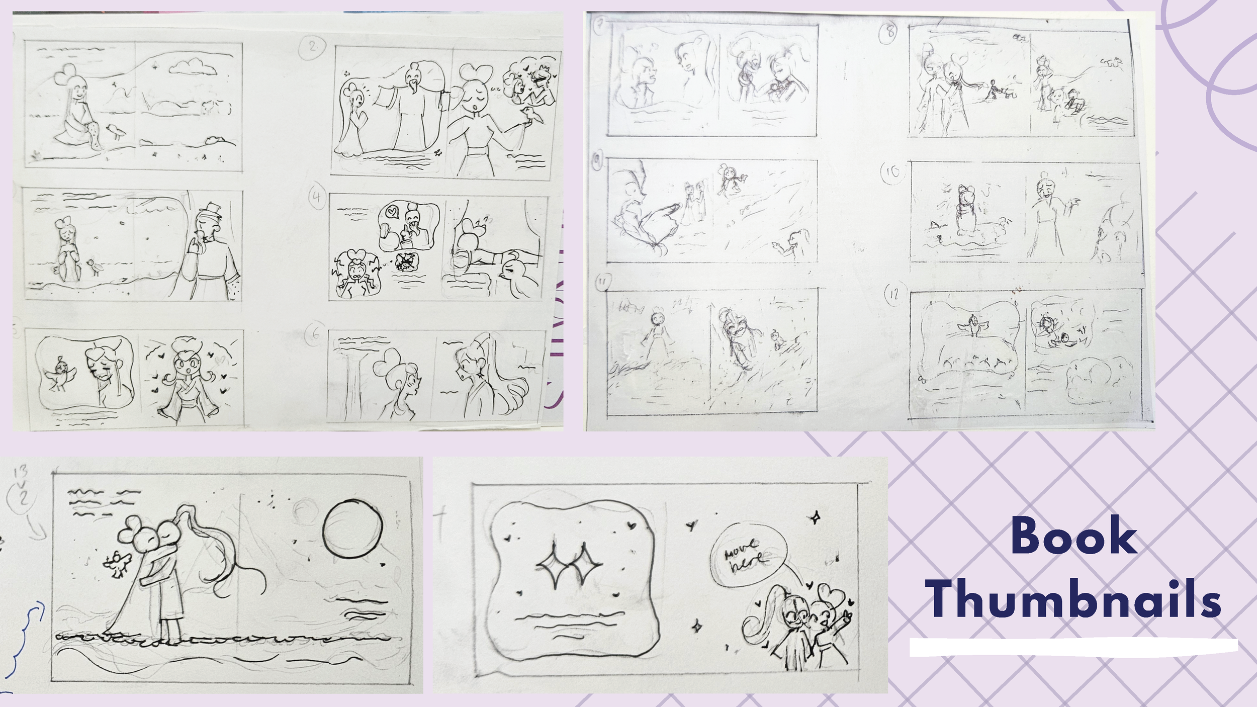


As a part of this project, I developed a picture book based on the Japanese story of Tanabata. This was developed with the idea that this would be a "Book of the Film", but tailored towards a younger audience.
I looked to follow trends found in my research of picture books, such as bright colours and lineless backgrounds, while having the characters in my own style to keep it unique.


Types Used

I liked the handwritten look of the “Hand Boys” type, and felt it added to the sense that this is a fairytale that has been written throughout time.
Dimbo Regular was used on areas of impact within the story, being bold while not taking away from the casual feeling of the font used throughout.
Poster Design
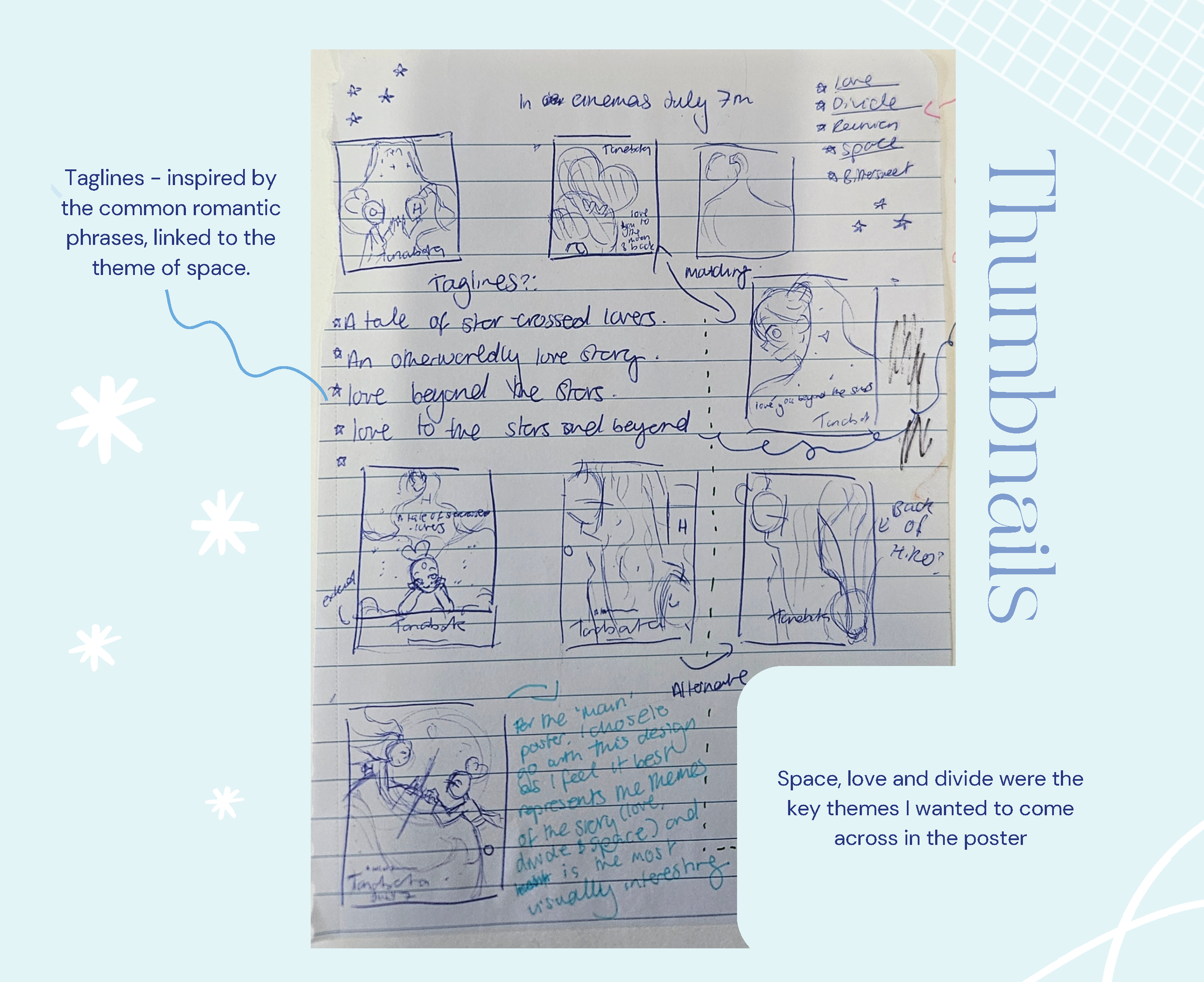
As part of this project, I developed posters that would be used to advertise the release of the film. Space, love and divide were the key themes I wanted to come across in the main poster, as these are found throughout the original story.
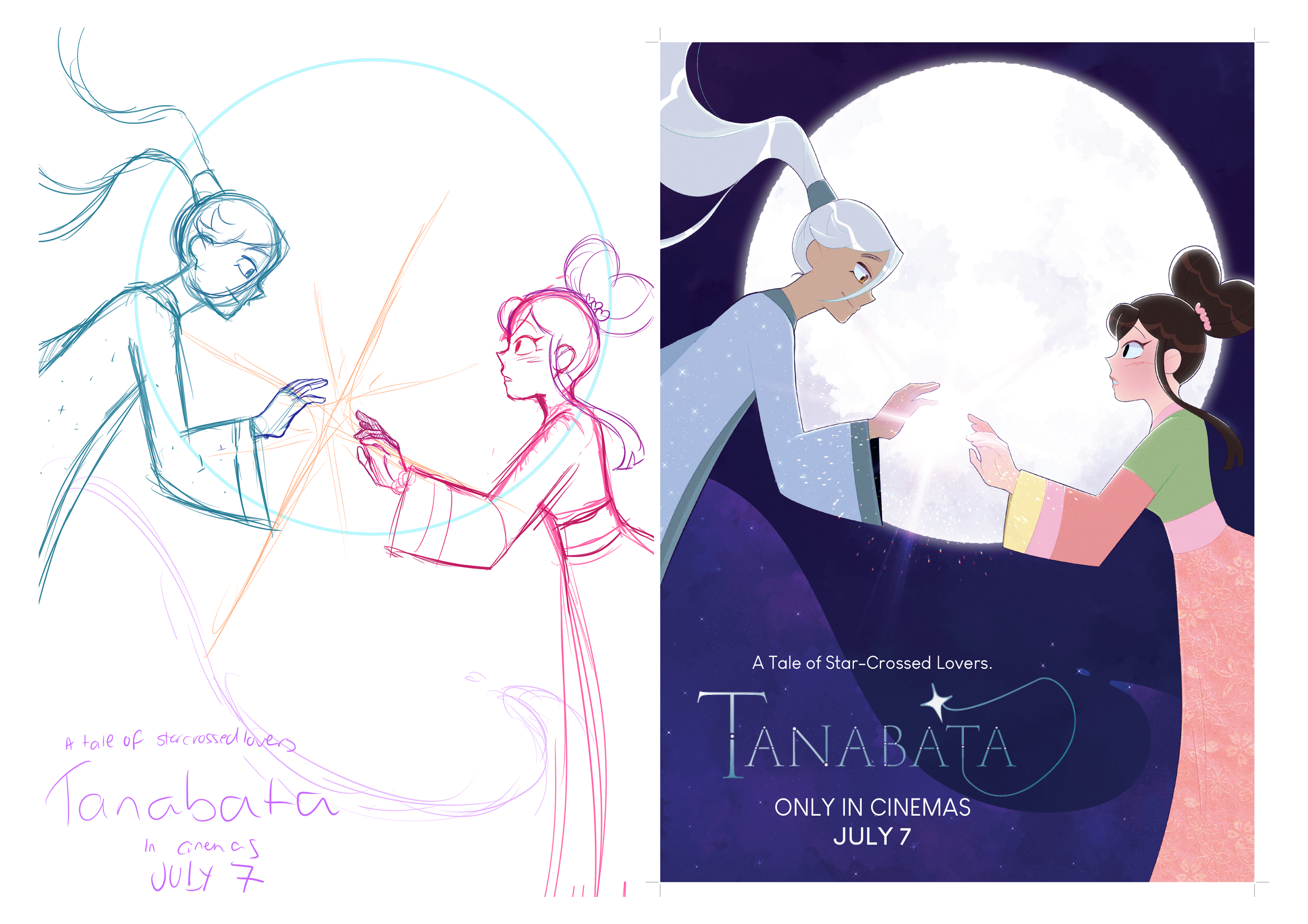
Teaser Posters
These two posters were created to match as a set. As commonly found in teaser posters, I focused on a key design element of the characters which best give an idea of their personalities - their hair - along with a tagline suiting their character motifs (love for Orihime and stars for Hikoboshi).

When creating Orihime’s poster, I found that beyond there was little room to place the text and logo in a way that wouldn’t cover the artwork while still being visually appealing. I therefore proceeded to scale her down slightly and instead have the tagline be on a path around her. This also had the benefit of creating a interesting point of interest.
After this, it was difficult to see the logo on the pink, and it felt somewhat disjointed from Hikoboshi’s poster. To counter this, I had the background instead be a gradient, helping solve both these issues.

Hikoboshi’s poster was somewhat more straightforward to create, given the amount of space his hair allows text to be placed in. At first, I had a subtle gradient in his hair, but ran into the issue of the logo not being very visible within it. I instead used a darker gradient which solved this. The tagline was then also placed on a path despite space being available within his hair as per the sketch. This was to make it so that the two posters better match each other.

Mockups


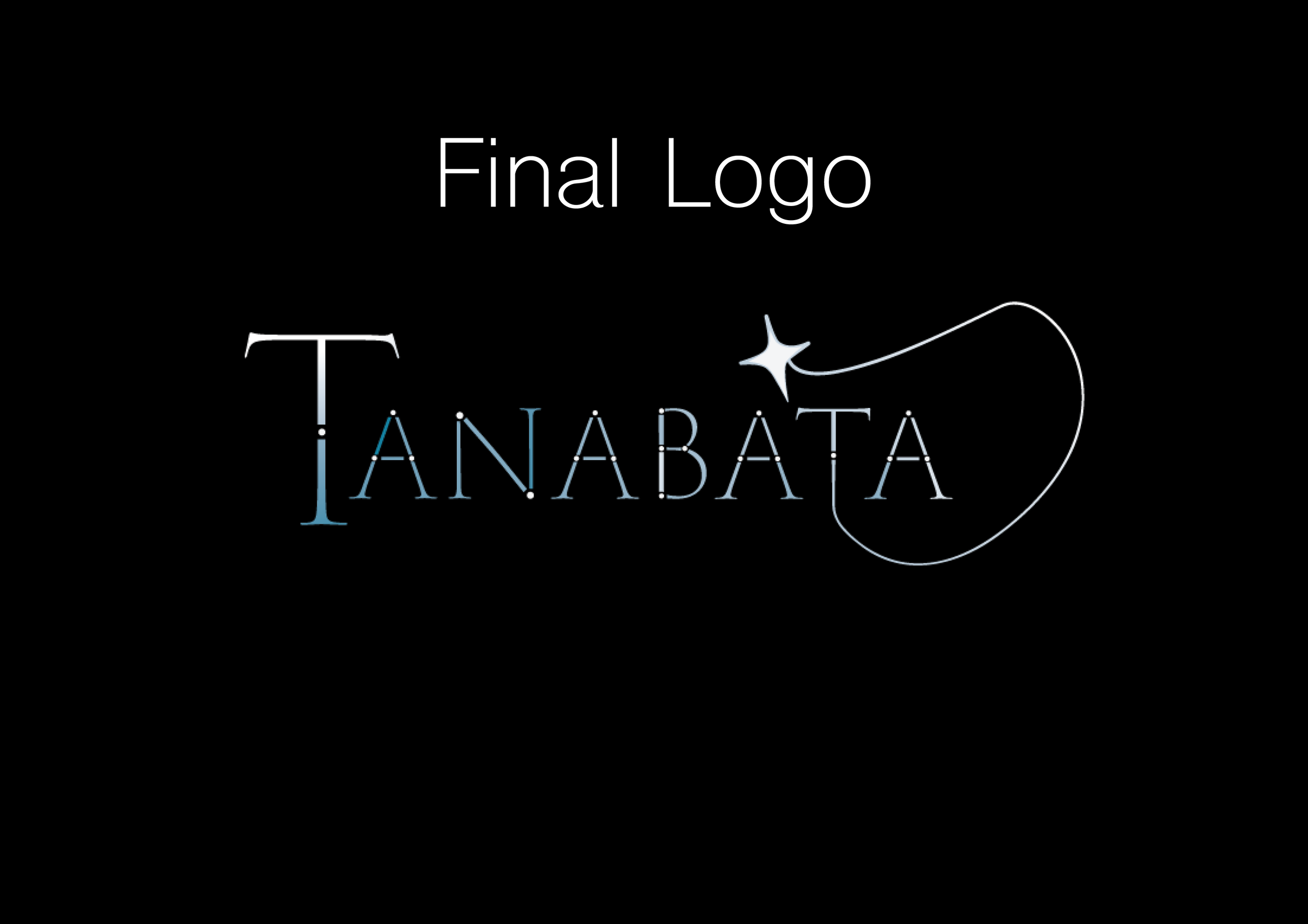
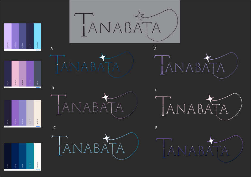
Logo Design
While creating the logo, the story's themes of the Milky Way stuck out to me and so I wanted this to be felt in the piece. As a result, I incorporated star imagery and specifically chose to work with the cool tones of purple and blue.
Looking at images of the milky way and night sky, I felt that these colours were most associated with these subjects, and so would be suit the logo.


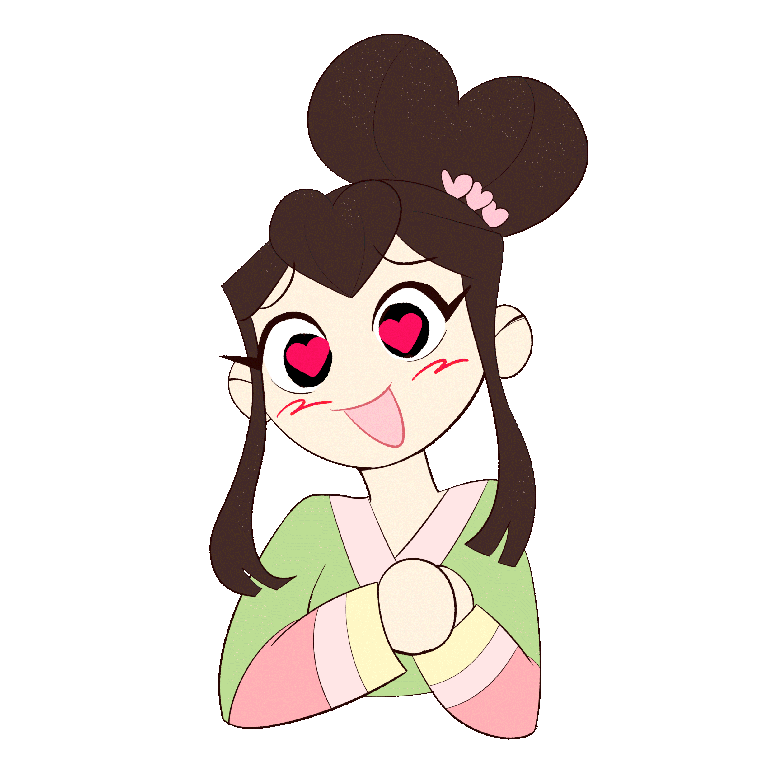
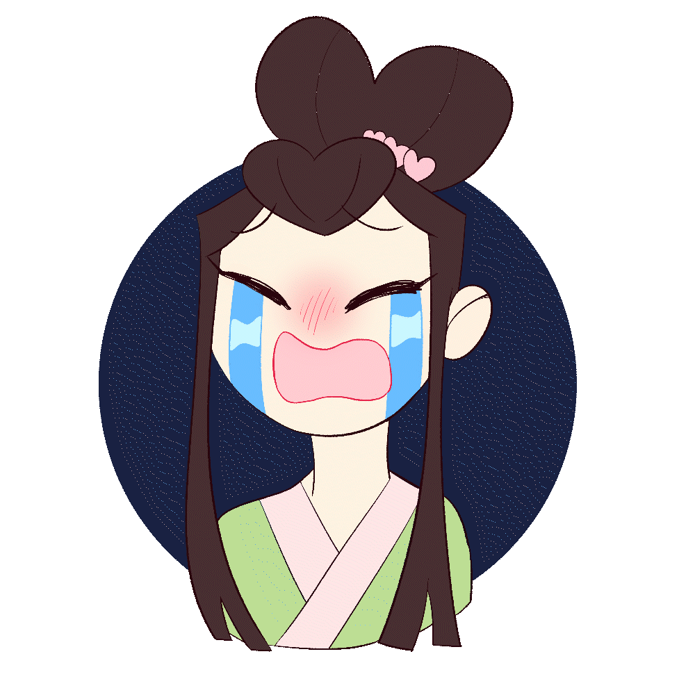
Animated Stickers
When planning the design for my stickers, I chose to base them off some commonly used emojis, as well as what expressions I thought would best suit the characters and their personalities.