Butternut Box – Paws in the Park Design Task
As a part of the interviewing process, I was given the task to design assets for Butternut Box's participation in the Paws in the Park event.
As headline sponsors, the brief stipulated the aim to not only increase awareness of Butternut Box but also to entice event attendees to engage with the brand. Assets should captivate event attendees, promote its fresh offering, and ultimately drive footfall to the stand, encouraging signups.


Tote Bag
When designing the tote bags, I wanted to ensure that the design would immediately draw attention.
Bright yellow was chosen as the base colour as it immediately draws the eye while also being synonymous with Butternut Box's brand.
Two variations were made as each carries an element over the other that achieves the brief. Variant 1 heavily emphasises the fresh aspect of Butternut Box’s brand, immediately giving an idea to the audience about what to expect. Variant 2, on the other hand, could be more appealing to be used more casually outside of the event, in turn providing the opportunity for a wider reach.
Digital Ad + MPU
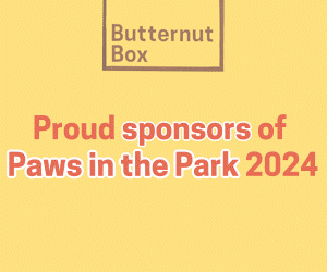
The MPU and digital ads were designed using the same principles in mind. I imagined that these could be one’s first interaction with the brand, and so created them with the idea of imprinting Butternut Box’s core identity; This means involving elements such as having yellow as the main colour and keeping consistent with the “fresh” tagline.

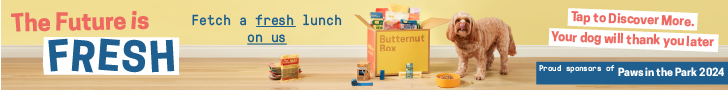
Website Banner
The website banner continues with the consistent branding seen in my previous designs. As this would be situated on Butternut Box’s main page, it would be better to focus on the discount being offered. This is because one visiting the site is likely already interested in purchasing a box, and so is more inclined to be interested in a chance to save.